// S4 · Brand & marketing design

Brand and marketing design, at startup speed.

End-to-end brand identity, marketing collateral, and creative strategy, powered by the fusion of human expertise and AI acceleration. We deliver in weeks what traditional agencies take months to produce.

00:00
// Case study · BYTE LIFE

From a blank page to opening day.

BYTE LIFE is a juice and coffee counter on a Bangalore engineering campus. It arrived with a location and a price ceiling. It left with a name, a promise, a cast of characters, a 74-page brand book, a website, a printer-ready production pack and a live Instagram account. This is the route it took, in order.

41Characters on one chassis
74Pages of brand book
9Logo routes explored, one chosen
60Print-ready files sent to the printer
1Live website, mybyte.life
01 · The brief

A counter, a campus and a ₹90 ceiling.

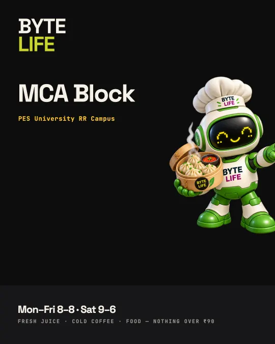
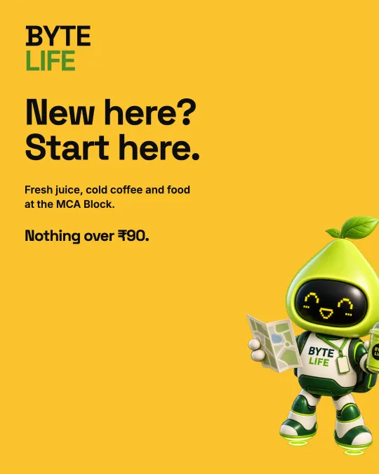
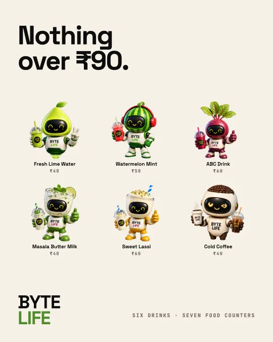
A counter in the MCA Block at PES University, RR Campus. Fresh juice, cold coffee and honest food, with nothing over ₹90. The customers are students aged 17 to 24 with twenty minutes between a lab and a submission.

We wrote the audience down as four people we could picture in the queue, not as market segments.

Branch 01 · MCA Block · PES University RR Campus
Fuel the people building tomorrow.
The Coder“I have twenty minutes and a viva at three.”
The Builder“We are shipping tonight either way.”
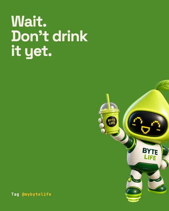
The Social Techie“Wait, do not drink it yet.”
The Young Professional“I used to get this one in third year.”
Audience profiles, from the brand book
02 · The name

A name you only have to say once.

We tested names that were cleverer than this one. They all failed the same test: a first-year had to have them spelled out twice at a noisy counter. BYTE LIFE passed it.

A byte is eight bits, the smallest useful unit, which suits a fifteen-minute break. LIFE keeps the brand warm. The pairing also produces its own headlines, and that matters on a campus where the marketing budget is mostly stickers.

B01000010Y01011001T01010100E01000101
BYTELIFE
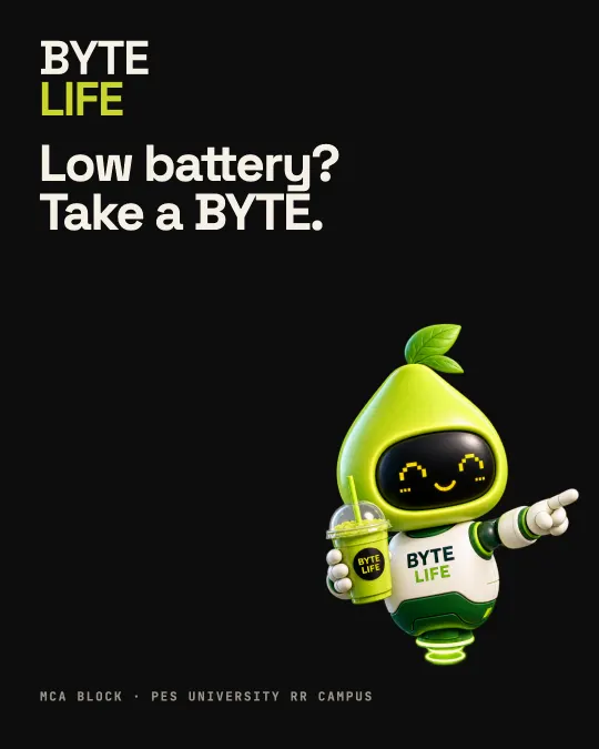
Take a BYTELow battery? Take a BYTE.BYTE of the weekFresh mind. Fast bytes.
One word from the machine, one from the canteen queue
03 · The promise

One line that never changes. Everything else can play.

Every campus juice bar uses the same four words: fresh, healthy, natural and pure. So we took a harder position, fresh fuel for people who think, build and live online, and fixed it in a master line that goes on the shopfront, the cup and every footer, in capitals with the full stops.

Campaign lines can be as playful as they like. This one doesn’t move.

Good food.Good energy.Better you.
Master line · do not alter Fresh mind. Fast bytes.
The master promise and the internal rallying line
04 · The mascot

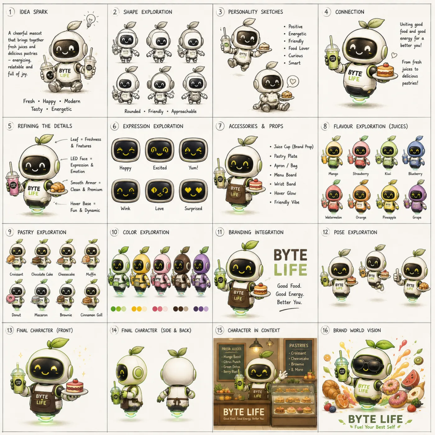
Sixteen steps from a sentence to a character.

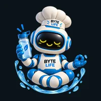
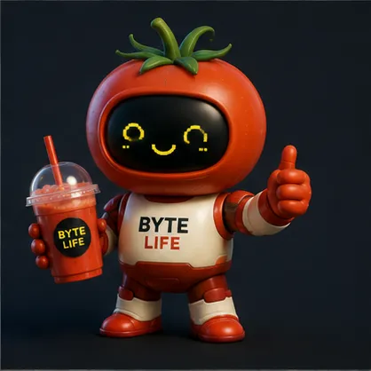
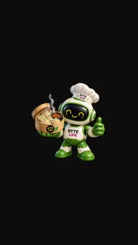
We chose a robot because it is the one figure that reads as technology and still feels warm. It is small, rounded and slightly clumsy. It is also how this audience jokes about itself: running low, needs charging, throwing errors.

BYTE was developed from idea spark through silhouette, expression, colour and branding to a final character. A creative director made every call, and image models rendered the options at a pace no illustration budget could match.

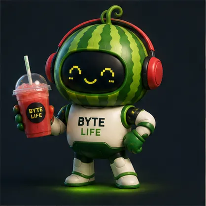
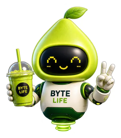
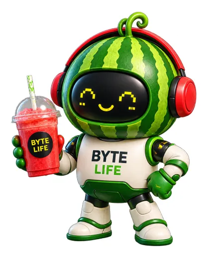
Development sheet for the BYTE mascot: idea spark, shape and personality sketches, expression, colour and branding exploration, through to the final character Lime BYTE, the finished character
Development sheet → Lime BYTE, the first of the cast
05 · The face

Everything happens on a black rectangle.

The face is a glossy LED screen showing nine expressions, all in Pixel Yellow #FAC22D and no other colour. There are no eyebrows and no mood colours. A character that is excited, winking and in love at once is a character nobody believes, so each expression has a defined job.

Each face is a true vector, so any new character is built from these rather than generated again.

LED face: happy
happy
LED face: excited
excited
LED face: yum
yum
LED face: wink
wink
LED face: love
love
LED face: surprised
surprised
LED face: focus
focus
LED face: sleepy
sleepy
LED face: loading
loading
The nine approved expressions, delivered as vectors
06 · The cast

The head is the costume.

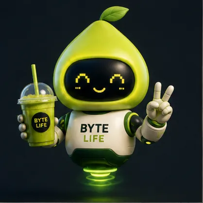
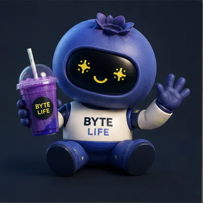
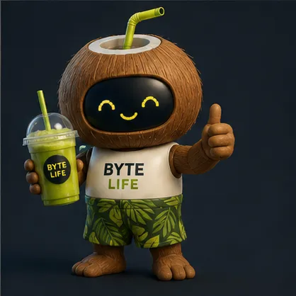
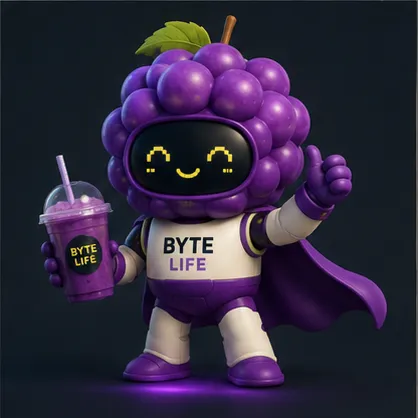
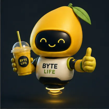
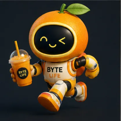
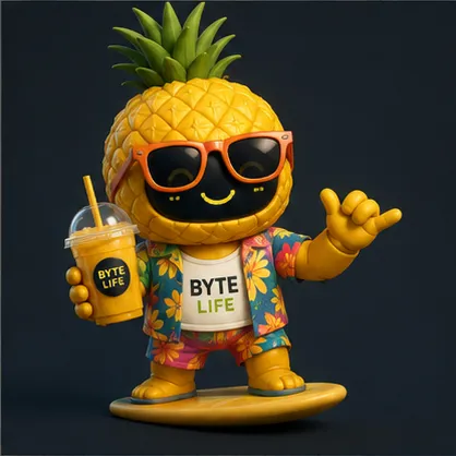
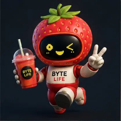
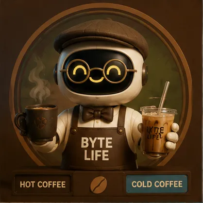
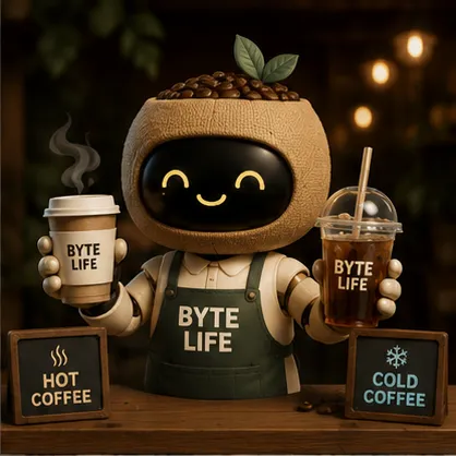
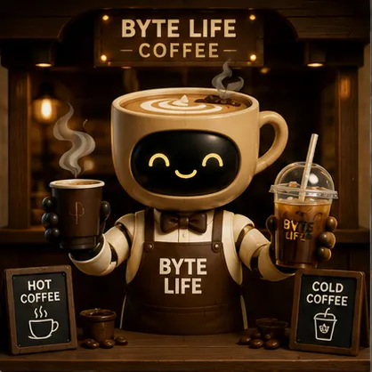
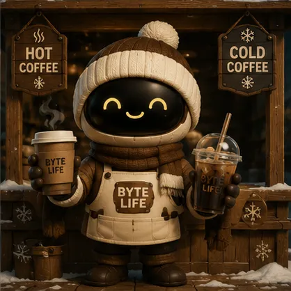
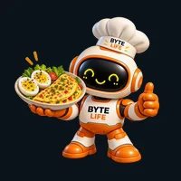
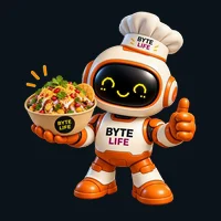
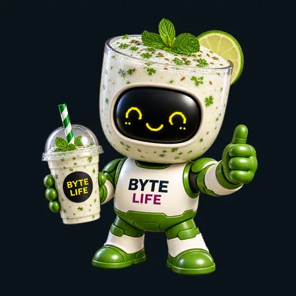
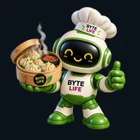
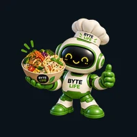
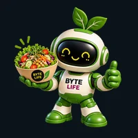
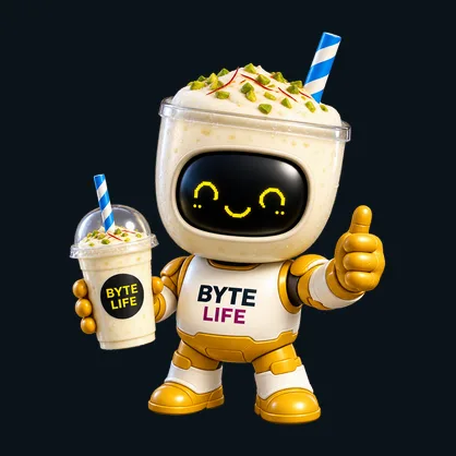
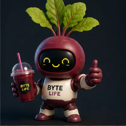
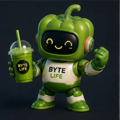
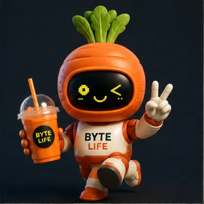
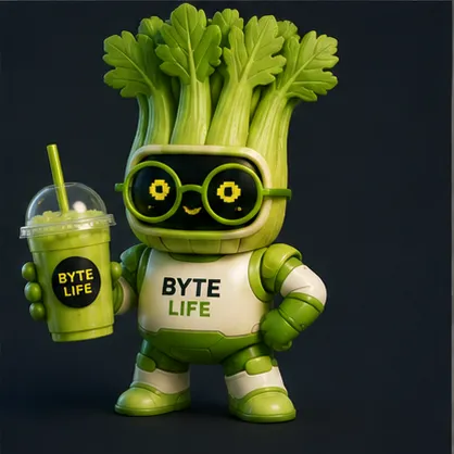
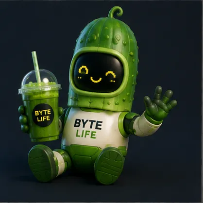
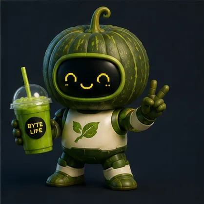
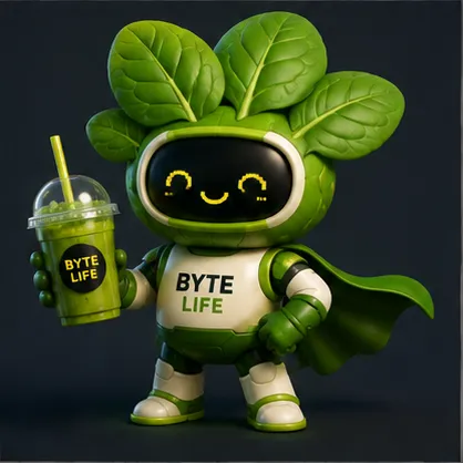
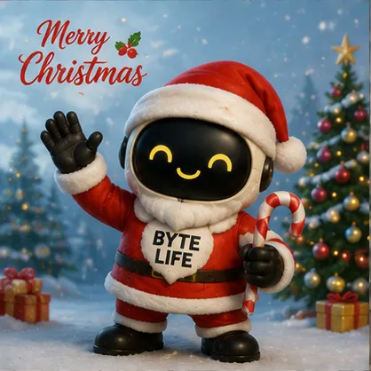
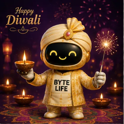
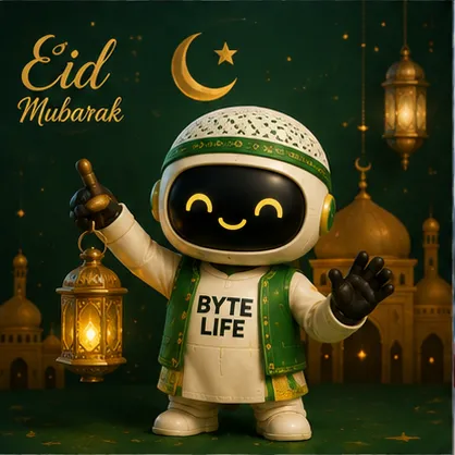
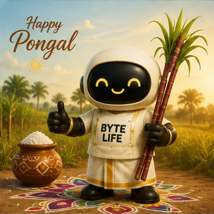
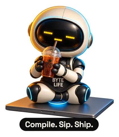
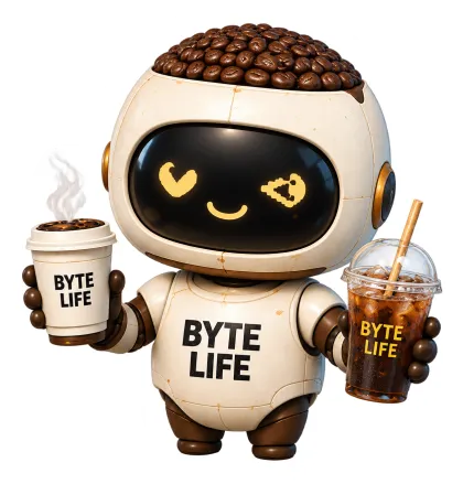
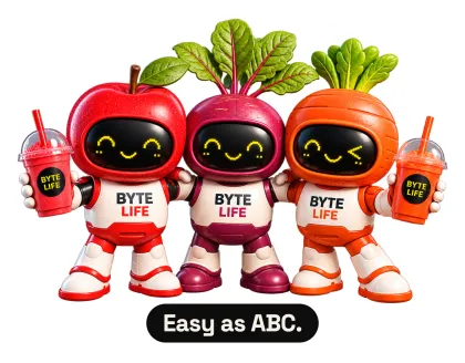
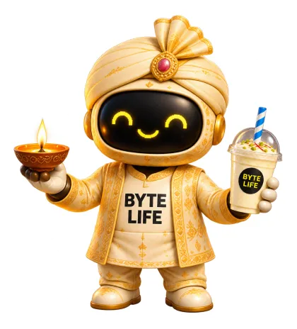
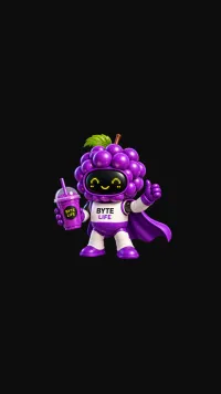
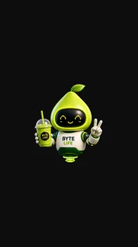
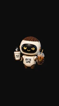
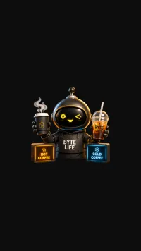
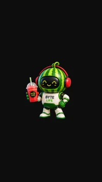
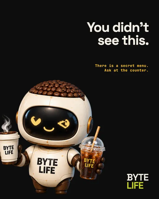
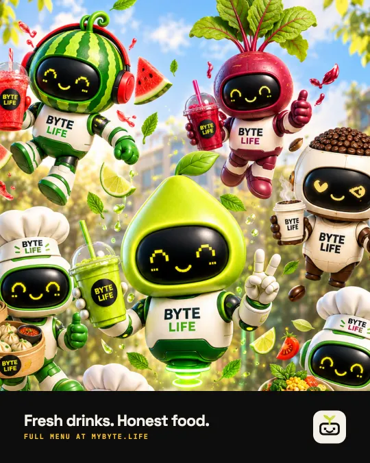
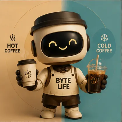
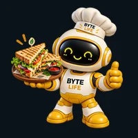
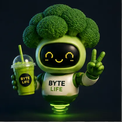
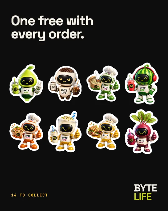
BYTE is a chassis rather than a single mascot. The body, face and drink stay the same while the head shell changes, so a menu becomes a collectable cast: fruit, veggie, coffee, counter and festival characters. Each one owns one colour, one drink and one personality.

Nine juices photographed on white look like every other juice bar in Bangalore. Nine characters don’t.

9 fruit9 veggie9 coffee9 counter5 festival
41 characters, one construction. Hover to stop the belt.
07 · The logo

Nine explorations, one decision.

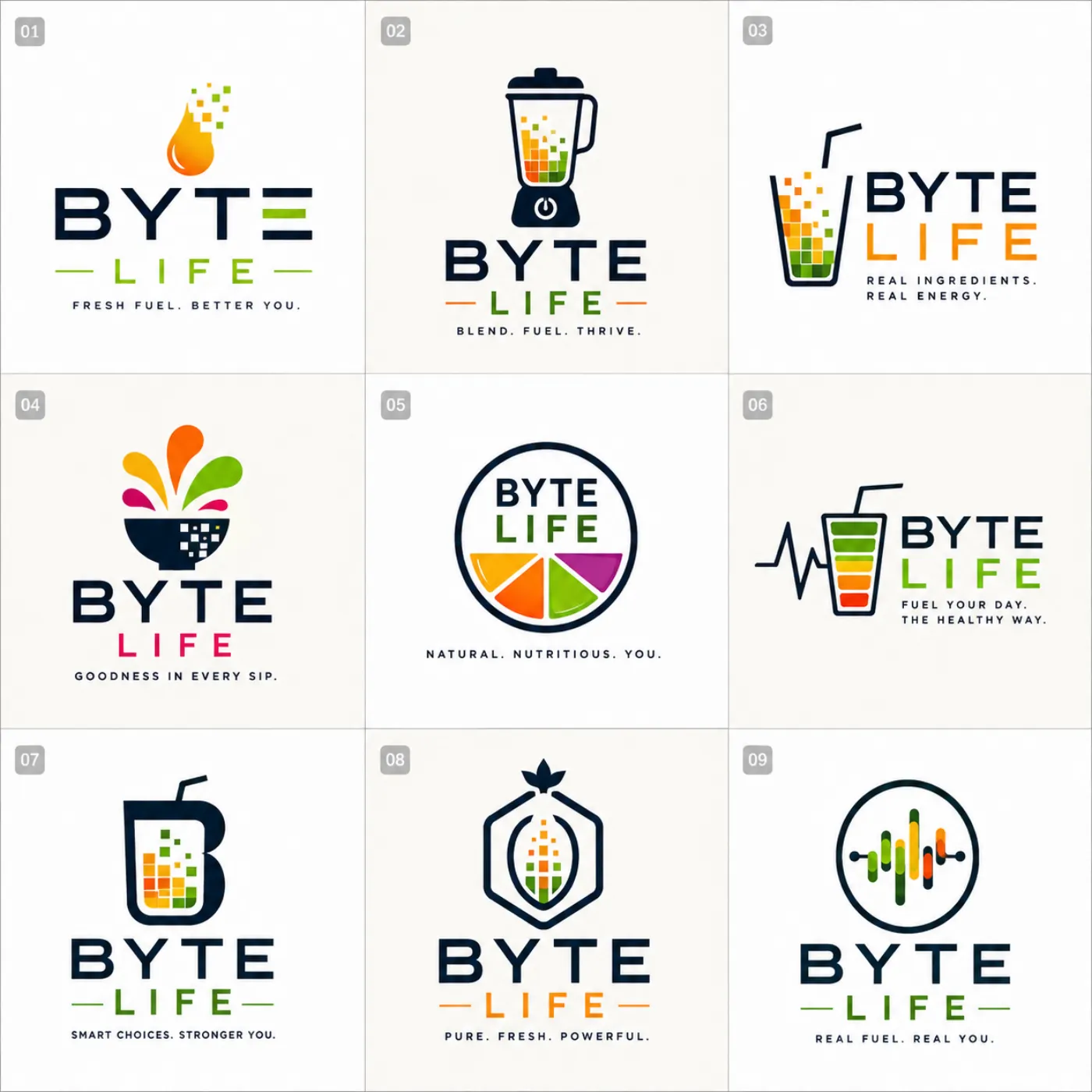
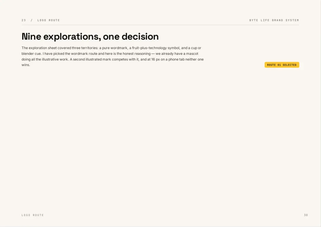
We explored nine routes, including icons, badges, a blender and a heartbeat. We chose the plainest: a stacked wordmark. The mascot already carries the personality, so the logo only has to be legible from a 40 mm sticker up to a shopfront.

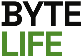
BYTE is always Ink. LIFE is always Sprout Green, Lime on dark, or Ink in one colour. The type is outlined, so the logo goes to a printer with no font attached.

Nine logo routes explored for BYTE LIFE
BYTE LIFE stacked wordmark, primary
Reversed wordmark
One-colour wordmark
BYTE LIFE Coffee sub-brand
Routes explored → primary, reversed, one-colour and the coffee sub-brand
08 · The mark and favicon

Down to sixteen pixels.

A brand also has to work in a browser tab. The favicon is the LED face reduced to three shapes, which still reads at 16 px. The sprout mark is the only element allowed to appear without the wordmark, and it is drawn for the app icon, for knockouts and for dark grounds.

BYTE LIFE · Juice & Coffee×
BYTE LIFE app icon
Favicon at 16 pixels
16
Favicon at 32 pixels
32
Favicon at 64 pixels
64
Favicon at 120 pixels
touch icon
Sprout mark
Sprout mark, knockout
Sprout mark, reversed
Favicon, app icon and the three sprout treatments
09 · Colour and type

Sampled from the renders, not invented.

The first draft specified navy and lime, and none of the artwork used either. Rather than re-render forty characters to match a swatch, we measured the palette out of the approved renders. Everything already made stayed on-brand from that day.

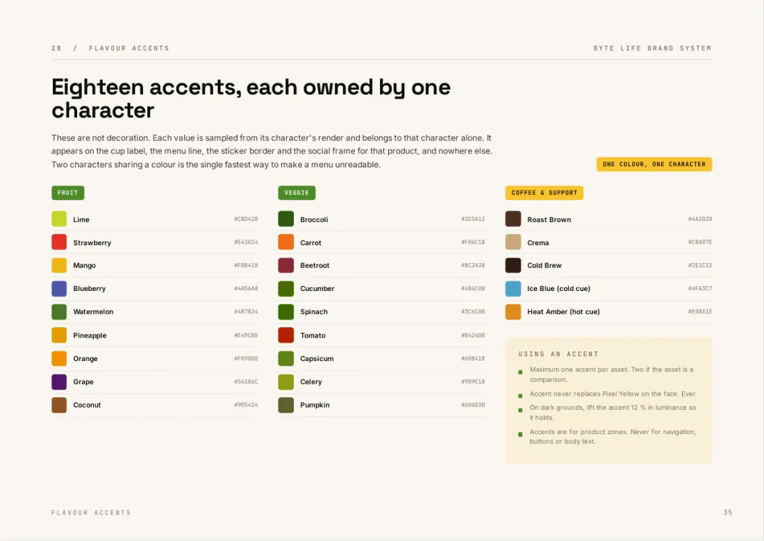
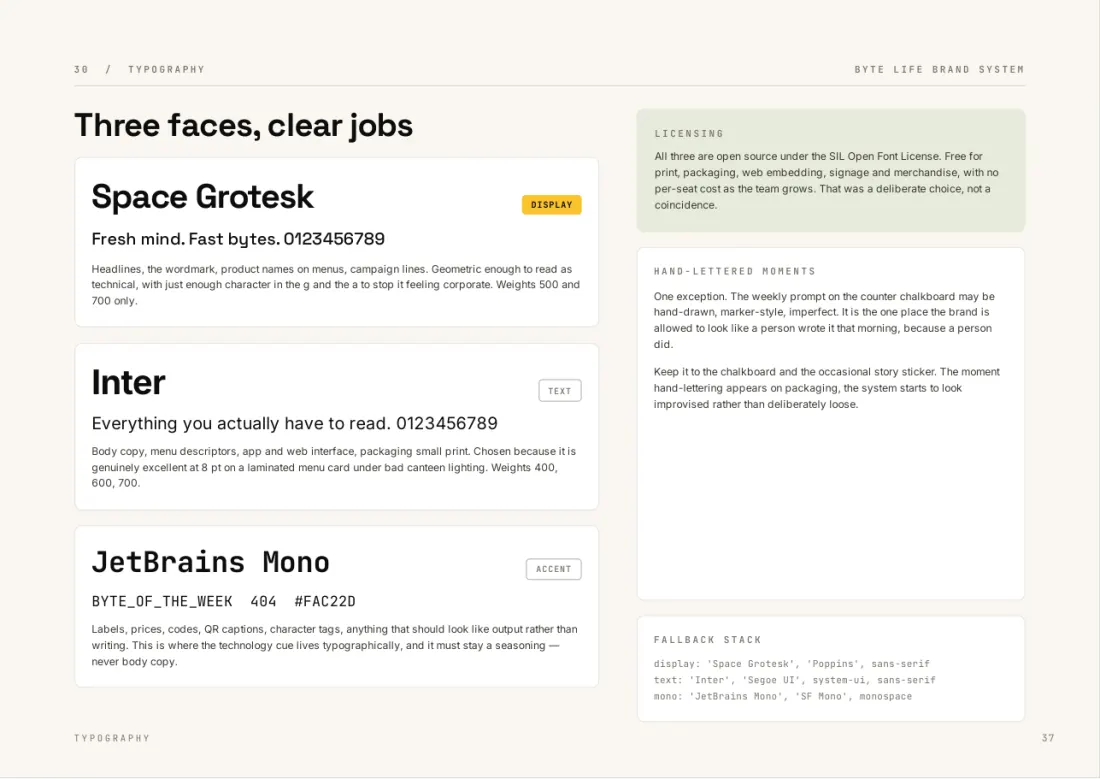
The rule is 60/25/10/5: cream or ink ground, the opposite colour for structure, Pixel Yellow only where the eye should go, and a little Sprout. The typefaces are Space Grotesk, Inter and JetBrains Mono, all open-licensed for print, web and merchandise.

Byte Ink#0D0D0C
Shell Cream#F5F0E6
Pixel Yellow#FAC22D
Sprout Green#4E8C2A
Roast Brown#4A3020
60 ground25 structure10 yellow5 sprout
AaSpace Grotesk · display
AaInter · body
AaJetBrains Mono · labels & prices
Five measured colours, a ratio and three typefaces
10 · The brand book

74 pages of rules, specs and arguments.

The book is written to be opened for one thing and closed in ten minutes. A signage vendor reads the shopfront spec and a student ambassador reads the voice pages. Rules are fixed, specs can go to a printer or developer without a follow-up call, and arguments are open to challenge.

Alongside it is a true-vector kit for Illustrator: logo lockups, faces, a swatch library, die lines for the cup, sleeve and bag, and a 1:1 shopfront elevation.

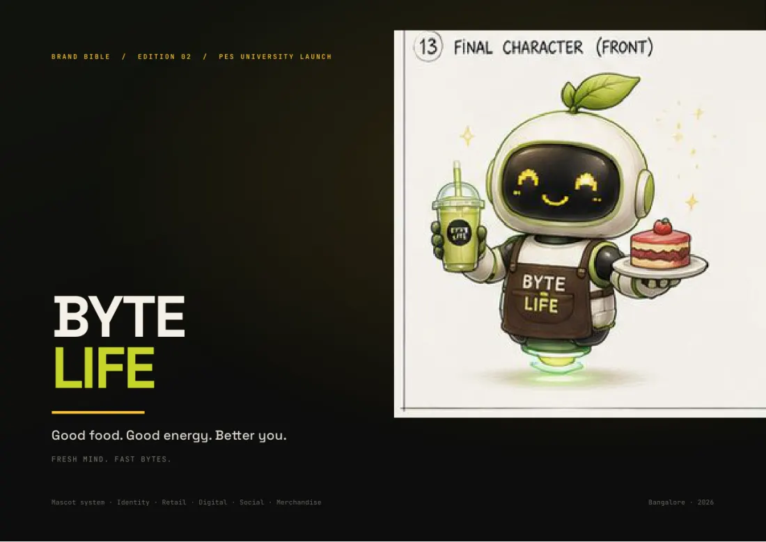
BYTE LIFE brand book, page 1: Cover · Edition 02
p.1 · Cover · Edition 02
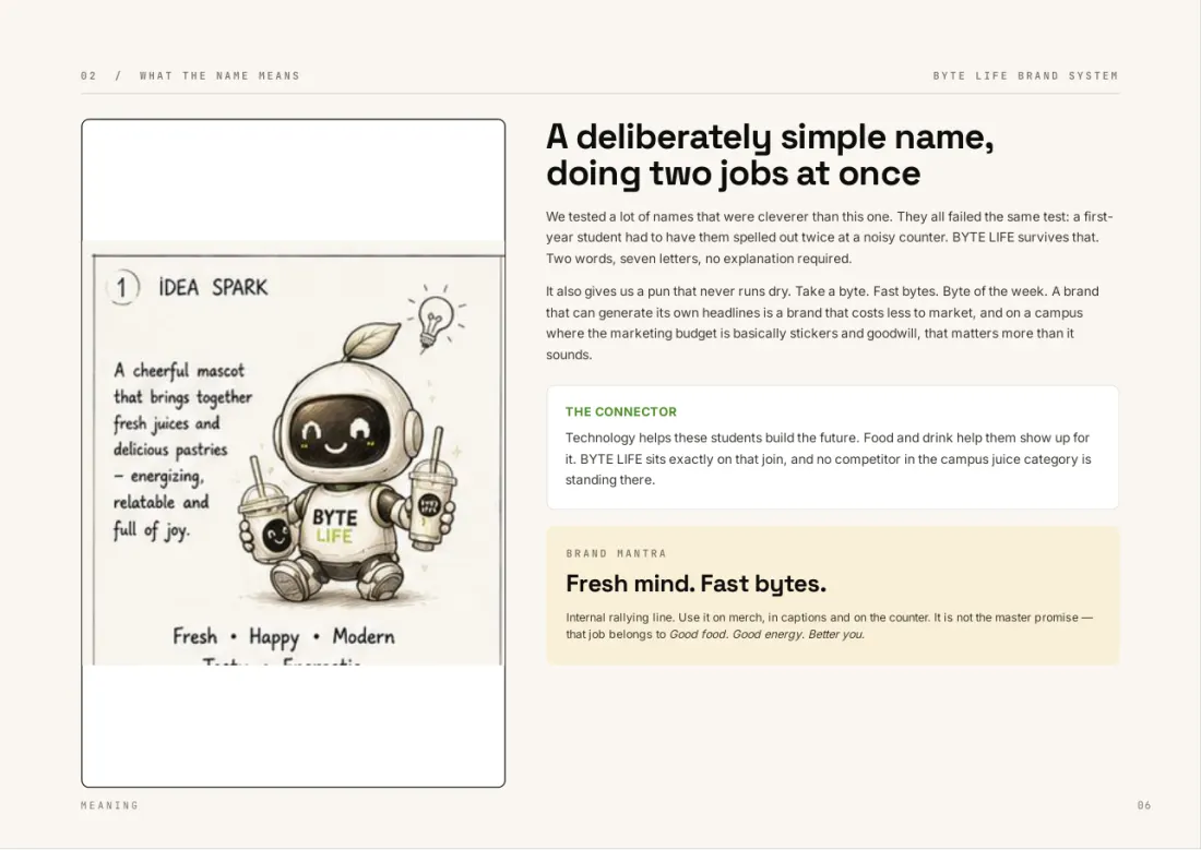
BYTE LIFE brand book, page 6: What the name means
p.6 · What the name means
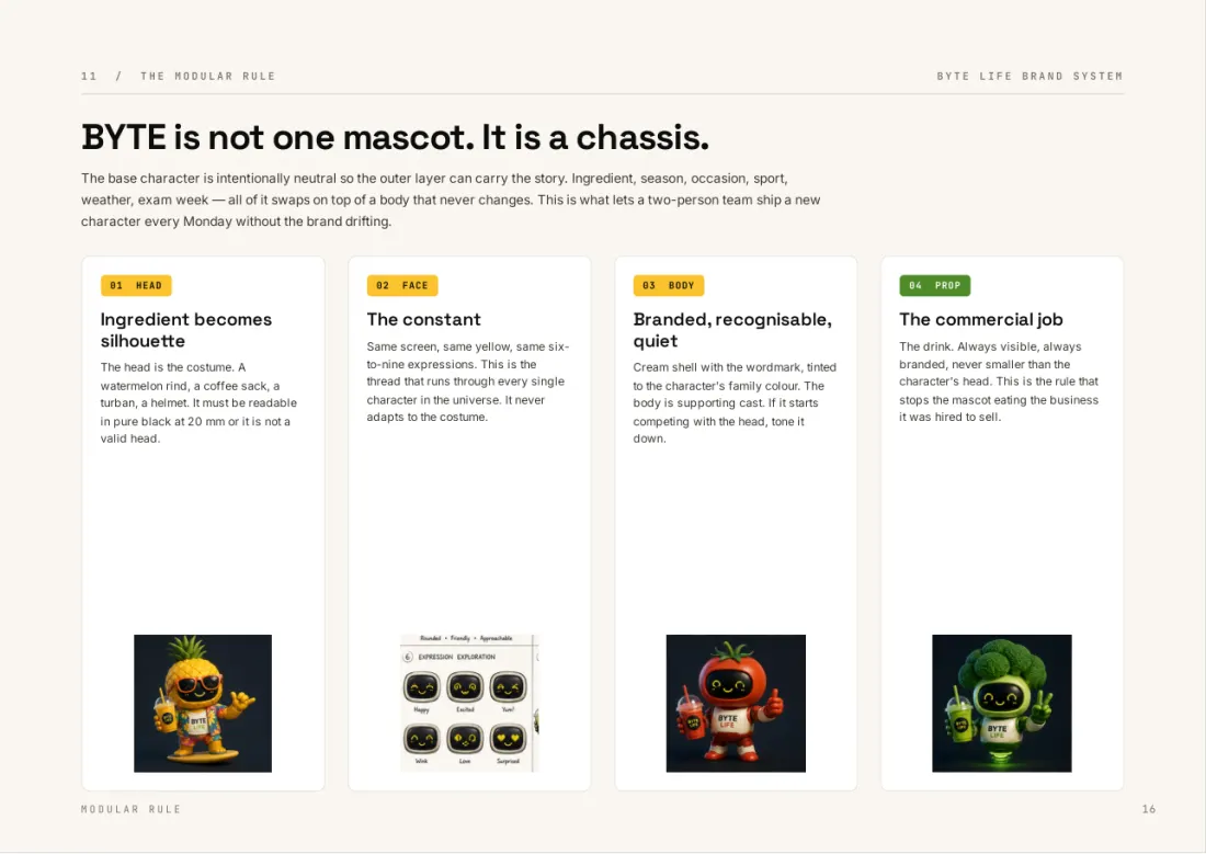
BYTE LIFE brand book, page 16: BYTE is a chassis, not one mascot
p.16 · BYTE is a chassis, not one mascot
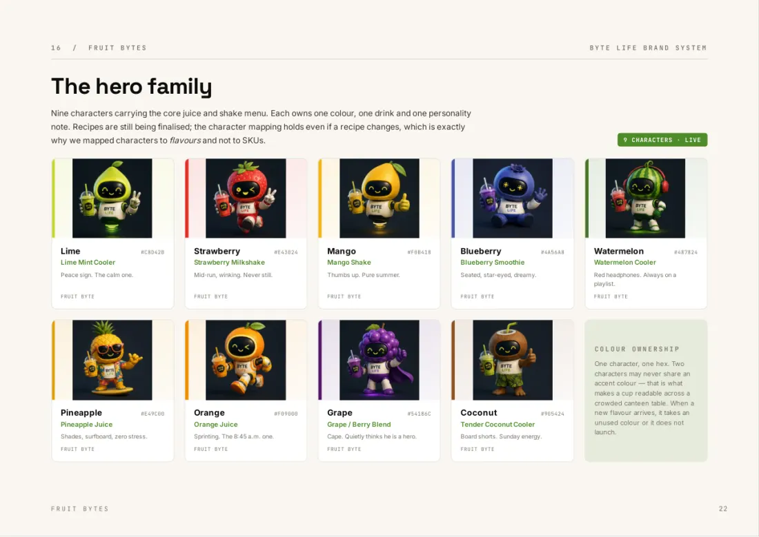
BYTE LIFE brand book, page 22: The hero family
p.22 · The hero family
BYTE LIFE brand book, page 30: Nine explorations, one decision
p.30 · Nine explorations, one decision
BYTE LIFE brand book, page 35: Palette sampled from the renders
p.35 · Palette sampled from the renders
BYTE LIFE brand book, page 37: Four grounds, four moods
p.37 · Four grounds, four moods
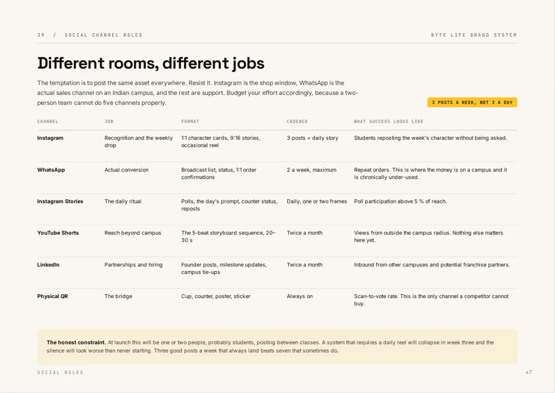
BYTE LIFE brand book, page 47: Web and app screens
p.47 · Web and app screens
Edition 02 · scroll the rail
11 · The website

A website built for the queue.

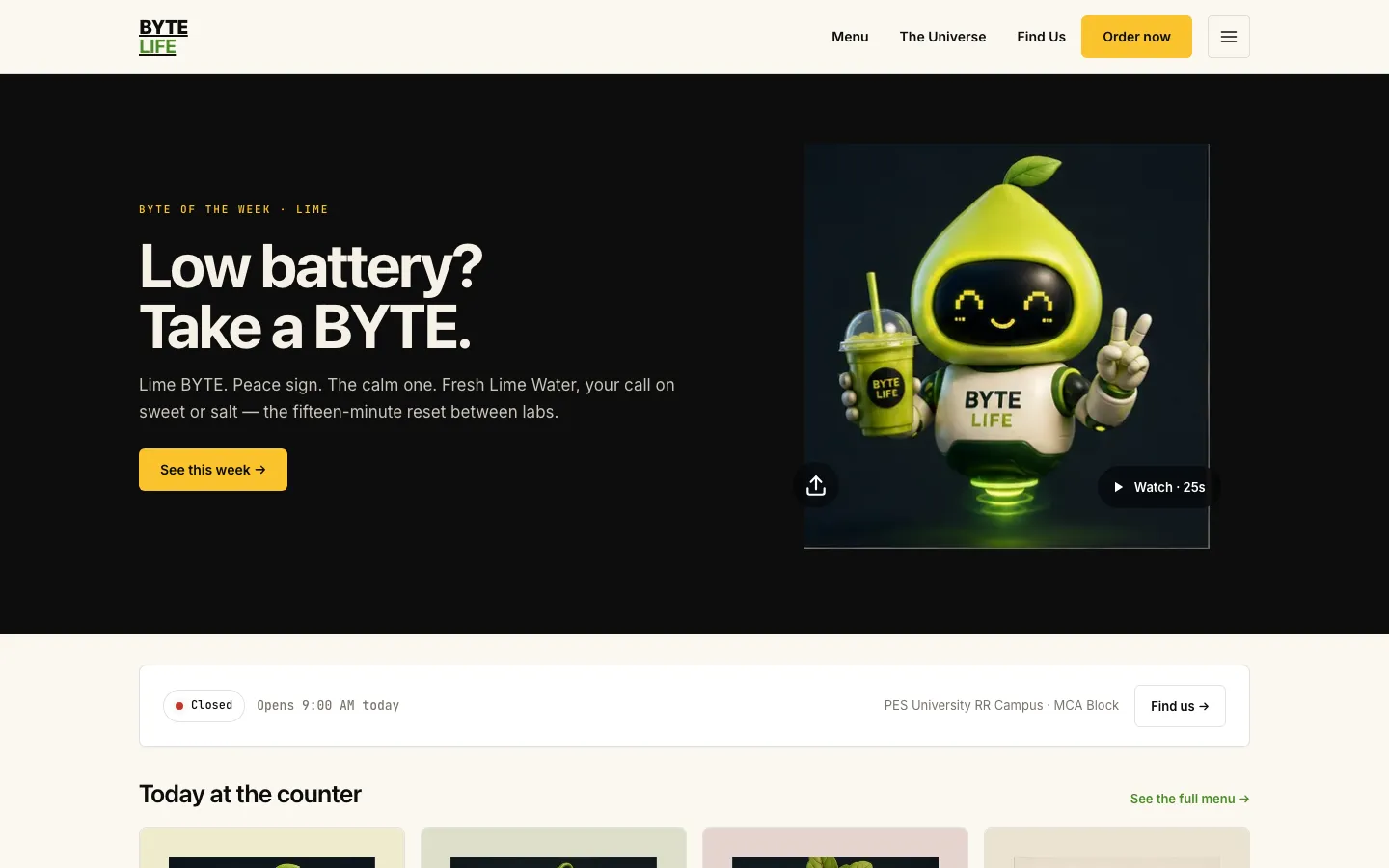
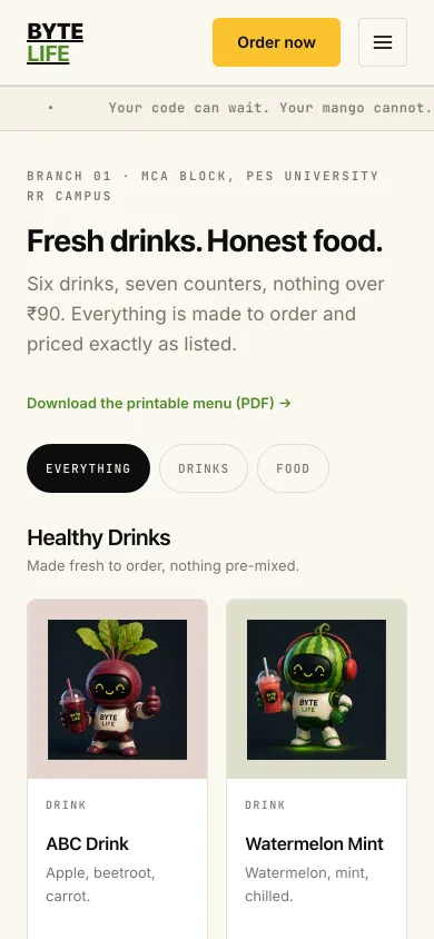
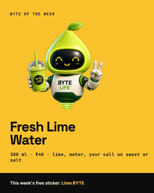
The site has a Byte of the Week on the home page, a menu priced to the rupee, and a printable menu PDF reachable by QR code from the counter. It is built mobile-first, because the QR code is scanned in a queue, and the brand book specifies it down to the tokens.
It is live at mybyte.life ↗

mybyte.life
BYTE LIFE website home page on desktop: Low battery? Take a BYTE.
BYTE LIFE menu page on a phone
Home on desktop, menu on mobile
12 · Print and place

Sixty files a printer can run without calling us.

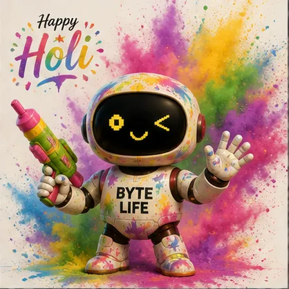
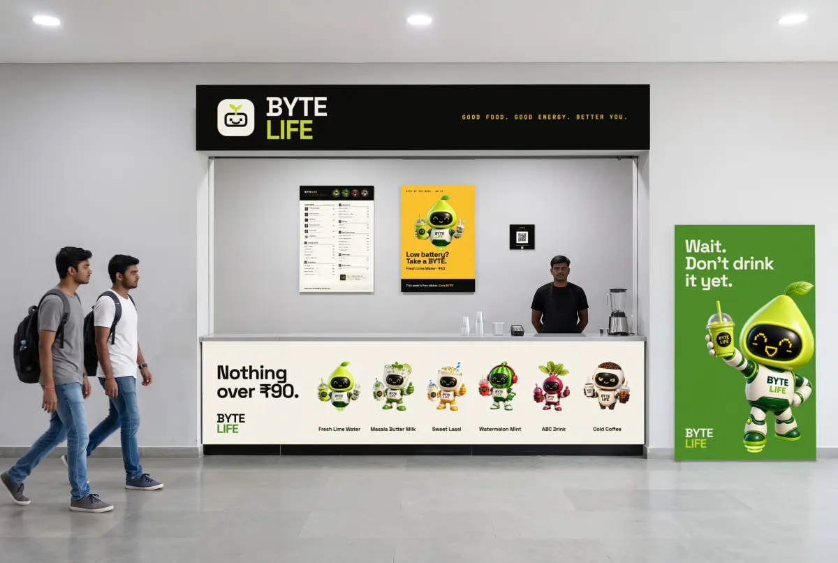
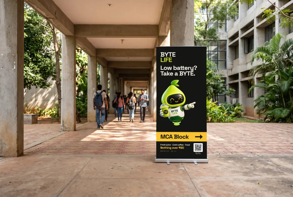
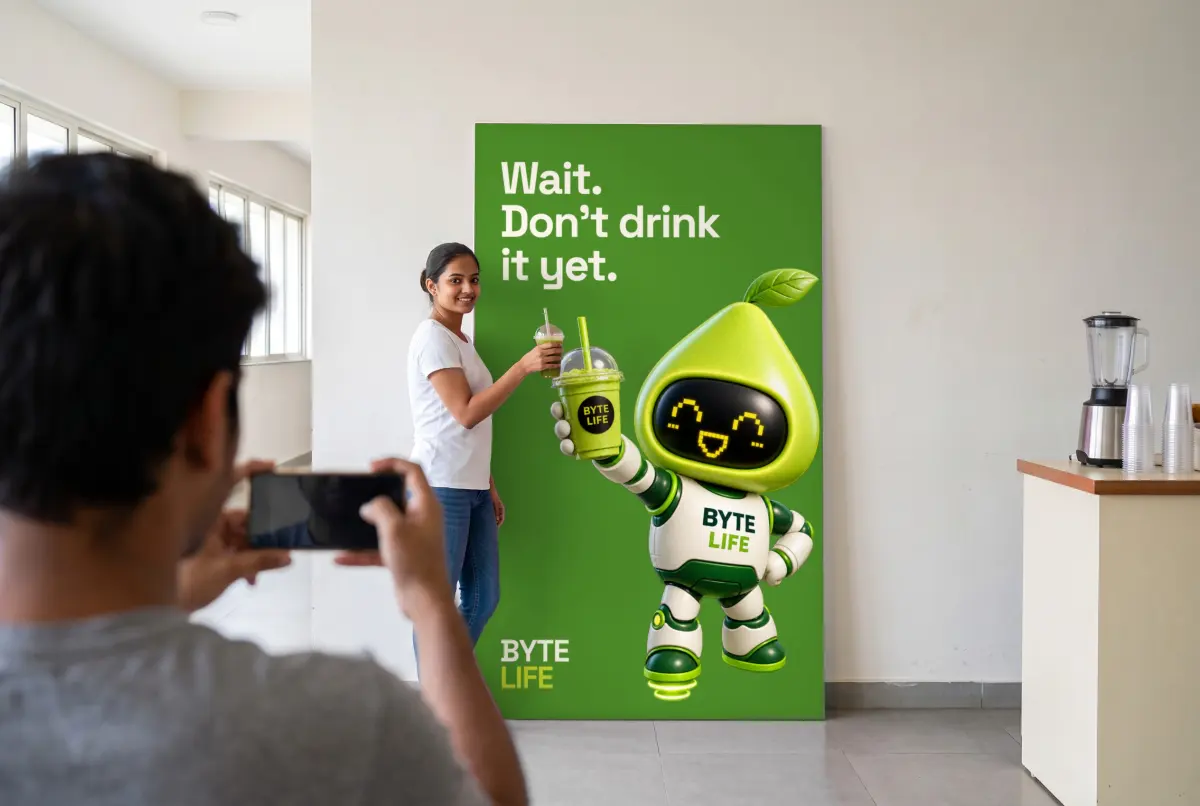
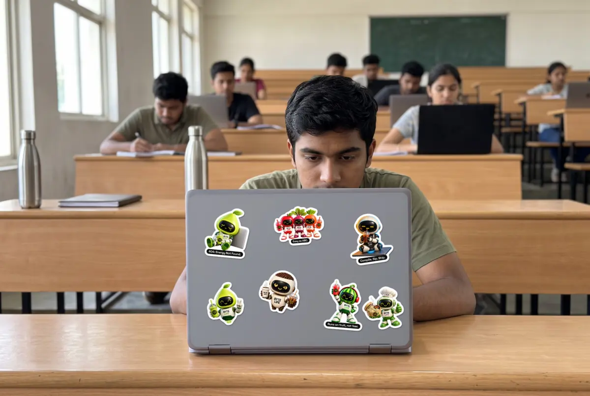
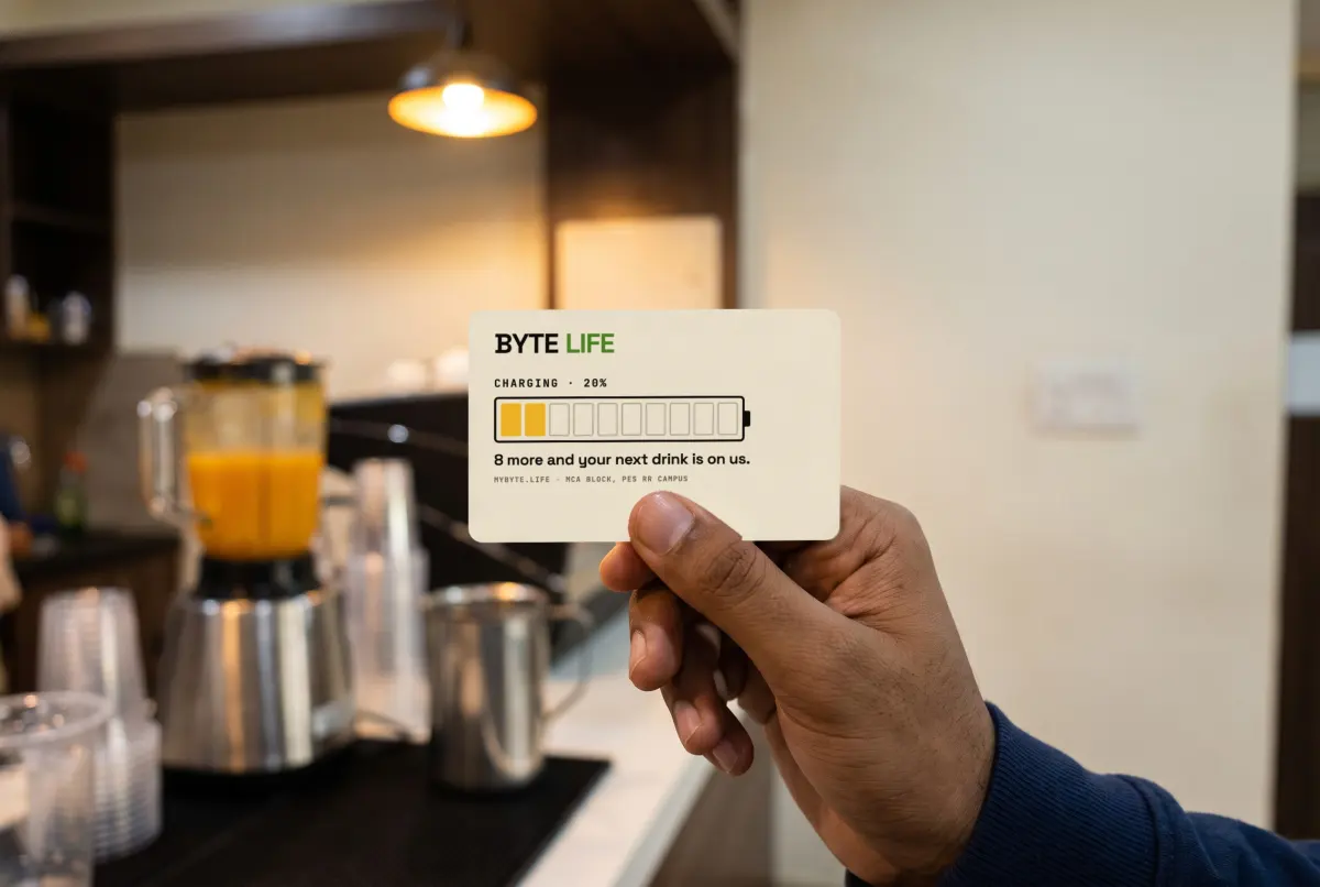
We produced standees, die-cut laptop stickers, circular stickers, posters, a counter cast panel, floor decals, a fascia sign, a loyalty card, a photo wall, the menu and visiting cards for both founders.

Each file has 3 mm bleed, outlined type and a print spec, and every QR code was decoded and tested before the pack went out. Each piece was also visualised in its real location before anyone paid for a print run.

Visualisation: the BYTE LIFE counter with cast panel, menu and standee
Counter · visualised
Visualisation: Lime BYTE standee in a campus corridor
Standee
Visualisation: the photo wall in use
Photo wall
Visualisation: BYTE LIFE stickers on a student's laptop
Laptop stickers
Visualisation: the loyalty card at the counter
Loyalty card
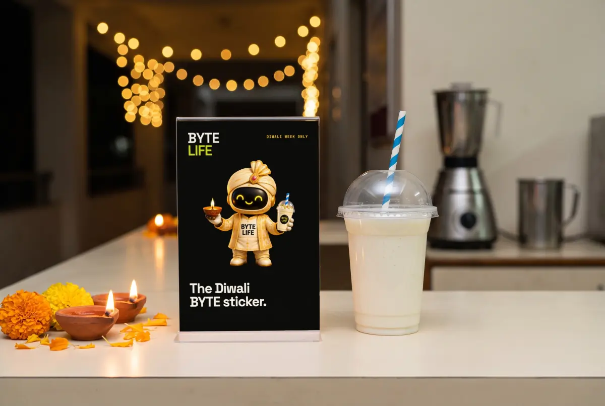
Visualisation: Diwali counter card
Diwali card
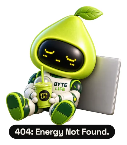
Sticker: 404 energy not found Sticker: Lime BYTE Laptop sticker Sticker: Roast BYTE Laptop sticker Sticker: Watermelon BYTE Sticker: Diwali BYTE
In-place visualisations, not photographs · die-cut stickers from the print pack
13 · Social and launch

A profile that looked finished on day one.

The Instagram account opened with a profile picture, six highlight covers with a story behind each, a nine-post grid designed as one board, and Reels. Posts, stories and Reels are published through the platform’s API, which gives the counter a weekly routine it can repeat.

Three of the nine posts promise things that are still at the printer, the stickers and the photo wall. They stay unpublished until the real items are at the counter.

Profile, highlights and the planned grid · two Reels

Branch 01 is the MCA Block. The system was built so the second branch needs no new brand.Brand → name → promise → mascot → logo → colour → book → web → print → social
// What this covers

What this line actually covers

This is FRAM3's original craft business: AI renders the options; people decide which one is the brand. We build complete brand guideline systems, logo design and visual identity, marketing collateral and campaign assets, and packaging or print design — the same deliverables a traditional branding agency would hand over, just produced on a faster and cheaper stack. Nobody at FRAM3 is asking an AI model to decide what a brand should stand for. That decision stays human. AI shortens the distance between a creative director's idea and a finished, production-ready asset — mockups, variants, print-ready files — so a studio this size can move at a pace usually reserved for much bigger shops.

The team is led by a Cannes Lion-winning creative director with 60+ ad films behind him, which matters more than it might sound. Most of what's wrong with AI-generated branding right now traces back to one thing: nobody with real creative judgment was in the room.
// Who it is for

Who this is for

Brands and agencies that need a full identity system — not just a logo — and want it in weeks rather than a two-quarter agency engagement. D2C and beauty brands, regional Indian brands expanding beyond one market, agencies who need overflow capacity without hiring, and anyone who's tried a DIY AI logo tool and ended up with something that looks fine but forgettable.

// The market, honestly

The market, honestly

There are two very different kinds of competitors here, and they fail in opposite ways.

DIY AI tools — Looka, Tailor Brands, Brandmark, Canva's AI features — are fast and cheap, and that's genuinely useful for a solo founder who needs *something* this week. But 2025 was the year "AI slop" became a real term people use (Merriam-Webster even named it word of the year), and brand design is exactly where that shows up: interchangeable geometric marks, safe serif fonts, logos that could belong to any company in the category. Consumers notice. Surveys now show "real people behind a brand" ranks above price or quality as a loyalty driver — people are actively looking for evidence a human made the decisions.

On the other end, larger AI-augmented studios (Superside is the clearest example — a subscription creative team running $10K–$100K/month engagements) and traditional Indian agencies (Elephant Design, DY Works, Landor India, and similar) are closer to what FRAM3 does, but most traditional shops are still bolting AI tools onto an unchanged process rather than rebuilding around it. Few combine genuine ad-craft pedigree with an AI-native production pipeline.
// Positioning

Where FRAM3 sits

Somewhere in between, on purpose: AI for speed and iteration, a named human creative director for strategy, taste, and the calls that shouldn't be automated, and enough India-market fluency — language, culture, retail context — that the traditional pure-AI platforms don't have. The pitch isn't "AI branding." It's branding, done faster, with a human still signing off on every decision that matters.

// What we deliver

What we deliver

  • Complete brand guideline systems (voice, visual identity, usage rules)
  • Logo design and visual identity
  • Marketing collateral and campaign assets
  • Packaging and print design

Have a project that fits this line?

Or one that fits none of them. Those are usually the interesting ones.